
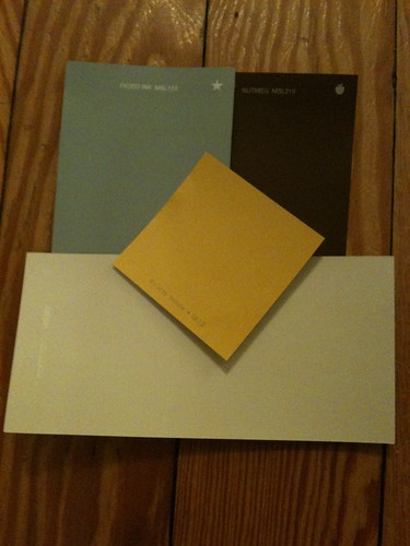
First, the ouside of the house. We're just going to work on the trim first, but we'll need to repaint the body of the house probably in a few years. The color we picked for that is identical to what it already is. But here's the palette...

From left to right, the colors are "Francesca" (for the brick at the foundation of the house), "Zinc" (house color), "Seal" (porch floor color). The middle color is "Bicycle Yellow" for the front door and "Picket Fence" for the trim (around windows and door, porch posts, etc). "Zinc" and "Seal" aren't really showing up true to color, but this was the best out of the photos I got. "Zinc" is more of a medium grey and "Seal" is kind of a charcoal-grey.
Living and dining room:
Top two colors are "Faded Ink" (walls), and "Nutmeg" (one wall in the Dining Room - I am not an accent wall person in the least, but this feels right to me... it's the wall of the dining room you see when you walk in the front door, and we gotta break up all that blue somehow. The credenza will be painted white and sitting on that wall - the contrast is going to be lovely!). Trim color (bottom) is once again, "Picket Fence" and I threw the "Bicycle Yellow" in there again just because yellow is going to be our accent color. I am not completely sold on that shade of blue, but the Bip is. I am going to let him win this one, and if it looks horrible, we'll just repaint.
Rest of the house:
I have these laid out kind of in the order you'll see them in, looking from the hallway, which is in the middle. I love these colors. They seem subtle, but I think they'll be anything but once they are on the walls. Also, I love how they don't overly compete with one another, since from the hallway you can see all of these rooms, including the living room.
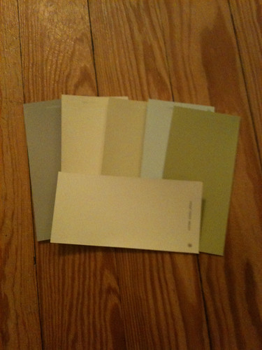
At the bottom, of course, we have the trim color, "Picket Fence" again. From left to right is "Chinchilla" (our bedroom - and looks almost exactly like one of my favorite nail polish colors "Chinchilly" by Essie), "Heavy Cream" (second bedroom/hopefully future nursery. I actually had this color in my old house, in the bedroom I intended to be a nursery someday, too. I am so glad Martha Stewart brought this color back for her new paint line! I know it looks a little bland and off-white, but when you get it on the wall, up against white trim, WOW! It feels so sunny and welcoming, and it really brightens up a room. Perfect for a baby's room, I think), "Hemp" (hallway), "Love-In-A-Mist" (bathroom.... only top half of walls, bottom half will be white beadboard wainscot. And wow, you should see how beautiful this color is in the sunlight up against the white trim), and last but not least - "Sultana" (3rd bedroom/library).
We love our yellow kitchen as-is. The paint needs a little freshening up, but we're just going to find a color that matches and go from there. No major changes in there, yet.
is there a picture of the "chinchilla" paint? i'm thinking about it in my living room and would love to see what it looks like on walls.
ReplyDeleteUnfortunately, the bedroom is still kind of a work in progress, and I haven't taken photos yet. You can kind of see it here:
ReplyDeletehttp://www.flickr.com/photos/sbarrington/4928901857/
It's quite lovely, though, especially if you are looking for a grey that's not too light and not too dark. It's truly 'just right'!